


Instagram Case Study
A case study for improvement to Instagram’s landing page leading to redesign. Includes mockups, information architecture, and 2025 updates.
4 weeks
Timeline
My Role
Lead Researcher & Designer
Tools
Figma, Miro, Adobe Illustrator, Figjam
Support
Case study prompt provided by senior designer and mentor Kristian Delacruz who challenged me to present this with research and full fidelity by end of time provided.
Background
Instagram is a leading social media platform that teems with growth while keeping its narrow, innovative scrolling gallery in tact and without much noise about the inner-workings, despite its close association with Facebook, whose growth and cracks therein have garnered a lot of attention.
What platform is more perfect to study user flows and their ultimate user journey than Instagram?
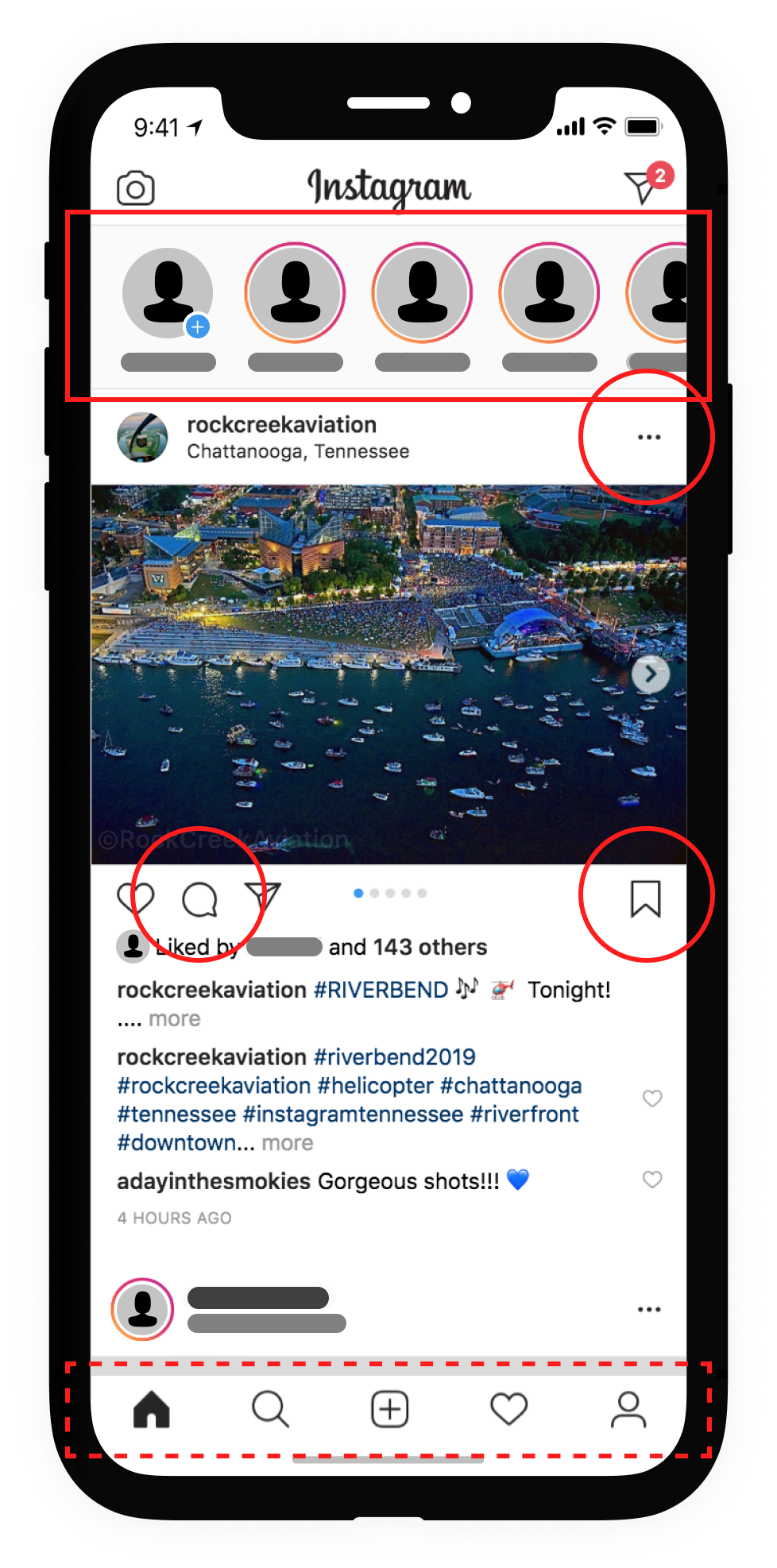
reference image
landing page : user feed
Note: Private accounts are censored in screenshot.Task
Observe Instagram’s landing page and explore how it can be improved, with special attention towards the user flow.
Because the task is open-ended and focused primarily on my POV, I decided that to stay within scope and to identify opportunities to dissect and study, I needed to better understand all the actions (starting task flows) the user can initiate without scrolling.
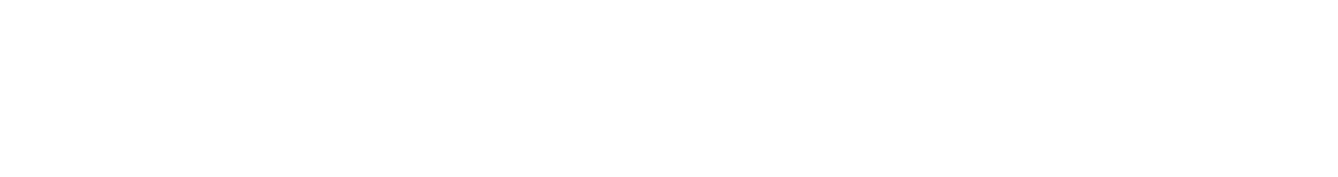
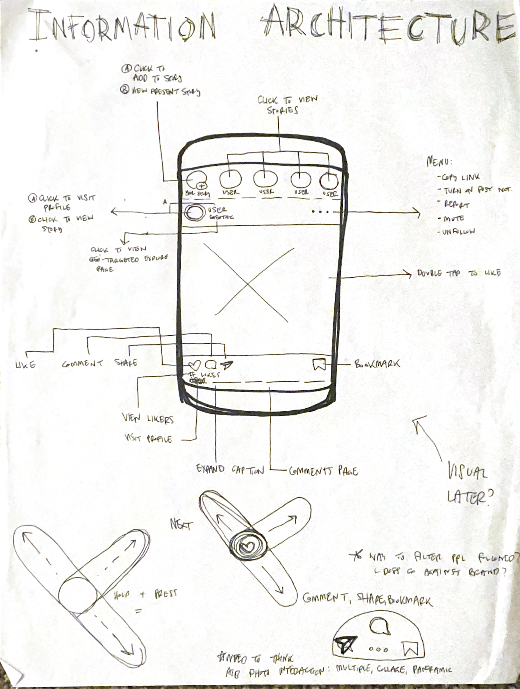
Defining the information architecture (A) informs me while allowing a careful combing to conduct a heuristics review (B)
A
B
Approach
Information Architecture
Observations

Information Architecture
A
Seeing how dynamic and anchoring the singular page is really pulled to focus how pervasive any changes made would be across the platform.
Questions coming to my mind include where are the redundancies? what is the overlap? what about the pain points and any added weight due to overlap in such an integrated system? how central are actions to the design of the home feed? I kept these in mind as I continued to study.
Observations
B
UI Review
Cluttered environment
Too many advertisements
Arduous to browse community
Sensitive controls
Unclear boundaries
Behavior Review
Muddled aesthetics
Overlapping functions
Blurred identity
Frustrating
Motivations
Instagram has become a pain to use: cluttered environment, an increasing inundation of ads, the limited sense of boundaries/sight, friend interaction decreasing, and frustrating, jocked technology.
Further considering:
Maturing ITV
Creating more community
A return to the user
Goal
Create a more user-friendly and inclusive design that ethically enhances existing experience, increases accessibility for all past, present, & future users, and returns to the forward-thinking and market leading brand that commands aesthetics and a nuanced-yet-simple visual approach to telling our own stories and rewriting our narratives while nurturing social interactions and community-building.

Challenges
With a goal being set and motivations now established, what outlying or relevant thoughts, concepts, and questions remain?
Technical
Existing structure and education (conditioning) on rigid strokes + rigid strokes and glyph (tap) led experience
Balancing responsiveness with changing screens & their technologies
Advertisements, viewing feed, and reload app
General
Increasing transparency has begun to clutter space, as well as financial respects like increased frequency of advertisements
Tightening platform & interactions while leaving freedom and control to users to make application service their own
How to change, but balance invested & curated, pre-existing user-based content?
Social/Ethics
Any major change will be faced with backlash: how to mitigate necessary change without putting off existing users?
Growing toxicity trends across social media
How do we handle Facebook integration and segregation?
Personas
Identifying 3 types of users who offer a representative, but sustaining base of present and frequent usage whose activity should be weighed more strongly in how the platform is built and retooled for the future.
Sketching
A look at a few sketches detailing how I came to understand and iterate on the product, its information architecture, its features, and iterate on potential solutions.
-
Visualizing pathways from the landing page.
-
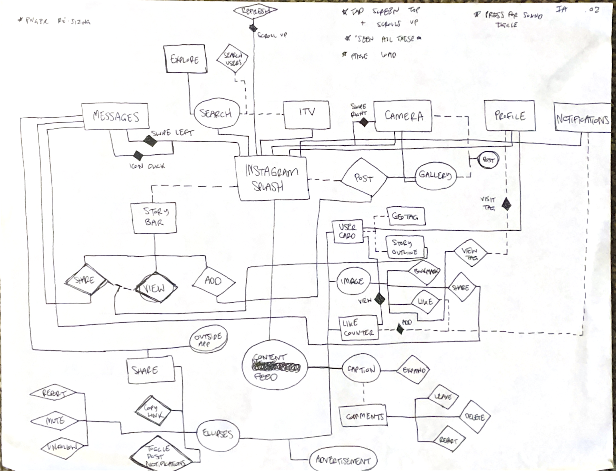
Early sketch of the information architecture.
-
Beginning to sketch out and understand design solutions.
Initial Solutions :
Strip it all away
Remove story bar
Remove icons
Remove likes
Remove fixed footer
…and keep it clean.
Let me explain how
Remember the time carved out to understand the system, leading to reviews and mapping out the information architecture?
It’s from this research that has informed a new approach to the how design can shift to better support the feature load and business demands while keeping the platform light and user friendly.
System Study
1
Testing
2

System Study : Introducing New Features
1
By eliminating the action clutter of icons and signifiers, micro interactions can be incorporated. New features can be added and absorbed, too. Hesitation is warranted (and accounted for) here, but the user knowledge is expert enough to allow for a pretty simple and seamless adoption in time. The concern should more be redirected towards accessibility. Do we leave users behind with replacing feed flows with micro interactions?
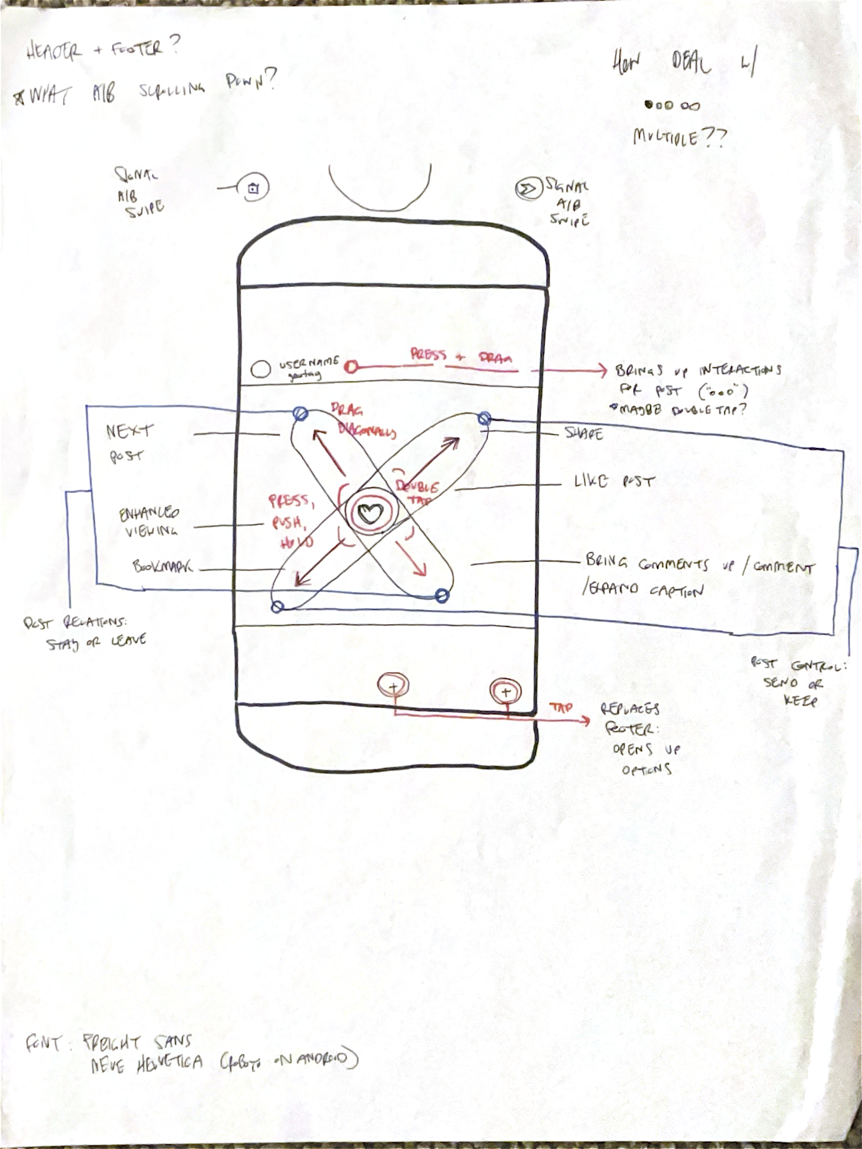
In lieu of user flows, the new working is presented below. Organized in 3 distinct ways: post relations (device left), content engagement (device center), and post control (device right).
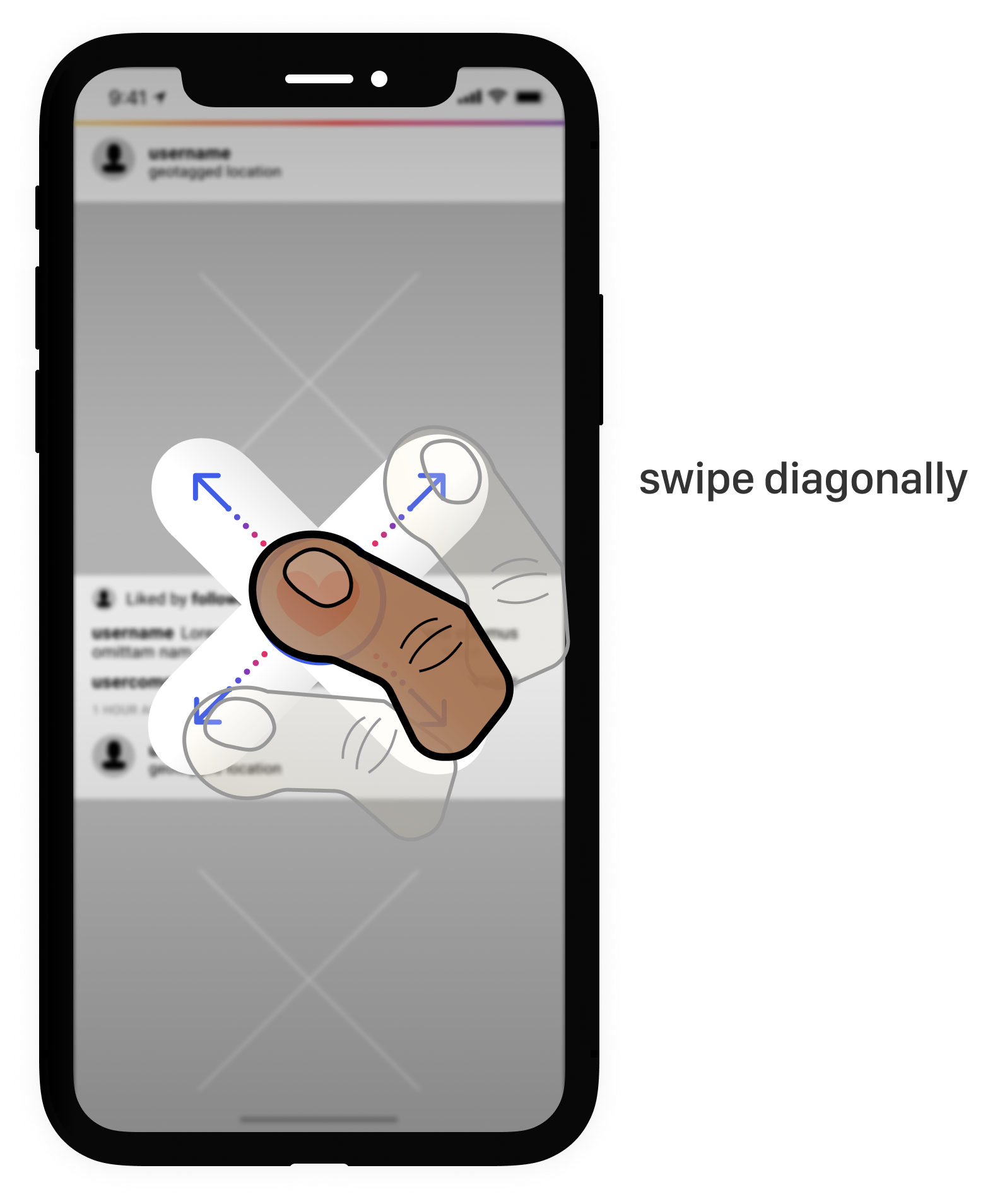
Action Control
The user can tap then/and* swipe diagonally to execute familiar actions or task flows (ex. reporting, messaging, etc.)
*sequence to be tested
Enhanced Engagements
The user can press and hold the content to isolate and enlarge or trigger an action. If media, the orientation of the device determines fullscreen activation.
Device-Left : Post Relations

Device-Right : Post Control
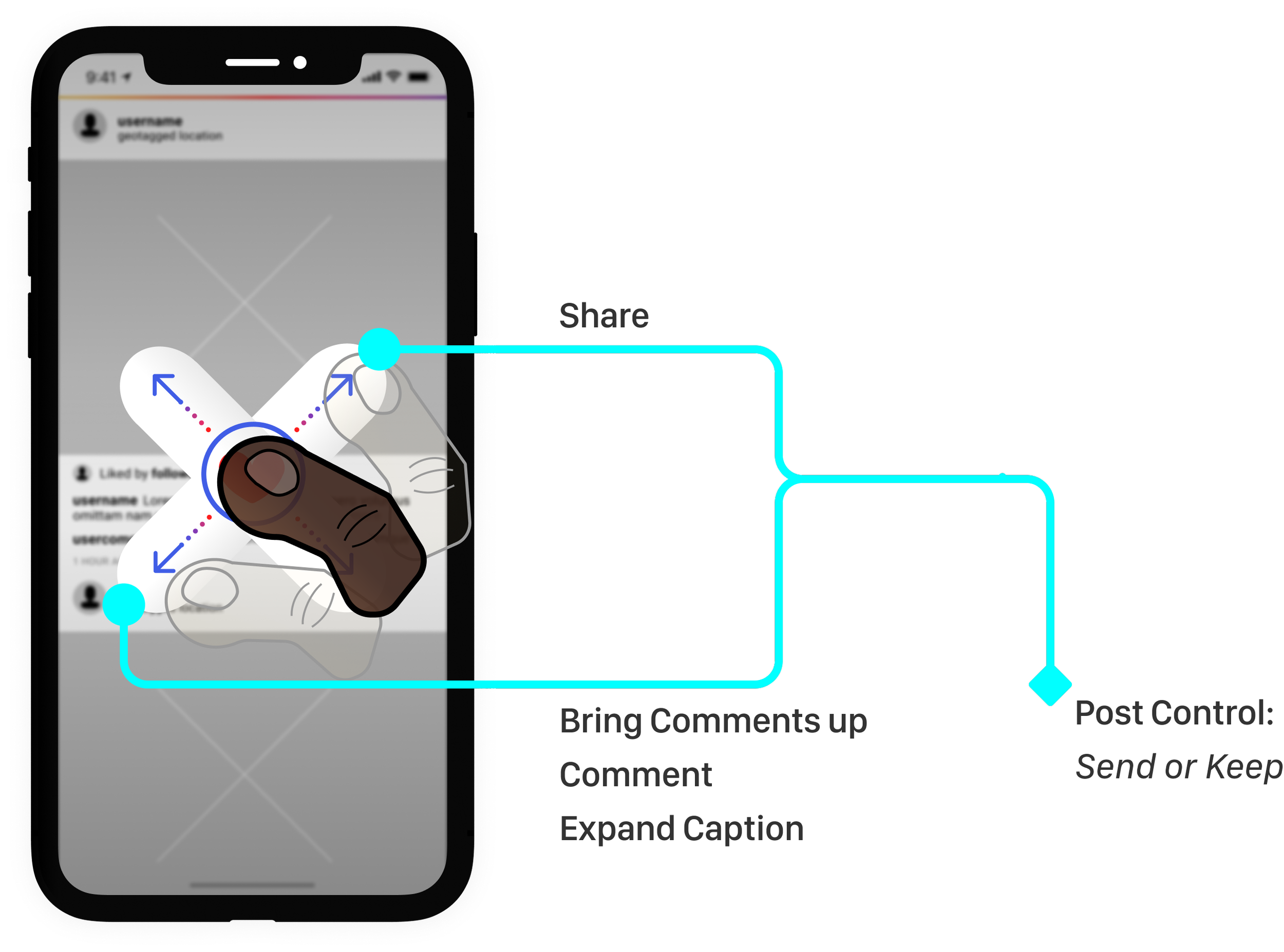
Post Relations:
Next/Previous Post (swipe)
Bookmark (tap/hold & swipe)
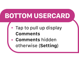
Post Control:
Share (tape/hold & swipe)
Comments+ (tap/hold & swipe)
Micro Interaction Example
Press and drag the usercard to the right
Action opens menu for post options
ex. copy link, report post

User Testing : Interviews & Design Feedback
2
Interview & Feedback
What is shown here has been edited for clarity and time
Participants ranged from friends, coworkers, acquaintances who were recruited on Instagram, through text, or in person
Effort made to recruit participants who represent a wide selection of users, including the 3 chosen for the user personas presented above
Initial interview and the follow-up for design feedback were all conducted in 2019 with the same participants
-
20
-
Multiple times a day
-
Catching up with friends/trends
Passive
Messaging
-
~67 minutes
-
~6 minutes (scrolling, interacting)
-
Media content
Posting/viewing stories
Seeing comments
-
Ads
Worry over missing posts or comments
Editing is difficult/time-consuming
-
6.3 out of 10
-
Prioritize content of Following
Make it easier to interact
Make it easier to edit
content (creation of)
stories (creation of)
comments
profile
messages
Interviews, April 2019
The nature of testing was to first gather feedback about the current landing page design and user friendliness of the highlighted annotated area.
Additionally, I was open to receiving miscellaneous thoughts and opinions throughout the interviews.
Design Feedback, May 2019
Lo-fi mockups and a deck presentation were shown to participants introducing the redesign and the proposal of new features.
The purpose of the feedback was to understand not only the reception of the features I was proposing to introduce, but I wanted to understand any friction since what came out of my study and ideation were entirely redesigned or newly introduced features (i.e. micro interactions).
I wanted to understand and anticipate future pain points.
Key Takeaways
20% express concern over motor skills/dexterity
60% able to understand new directional features upon first glance
90% favorable of large-scale redesign
Initial Proposal of New Features & Behaviors
With any widely sweeping changes to a platform, especially on a massively popular and charged-user base app like Instagram, these changes must be implemented at a staggered pace (at minimum). Let’s explore examples of where to start.
Micro Interactions
1
Enhanced Viewing
2
New Features : Micro Interactions
1
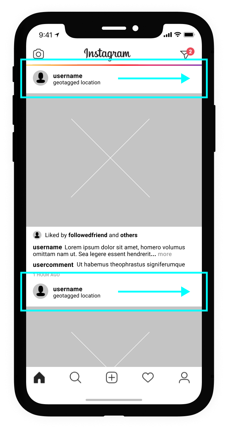
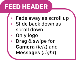
Collapsible Stories Bar

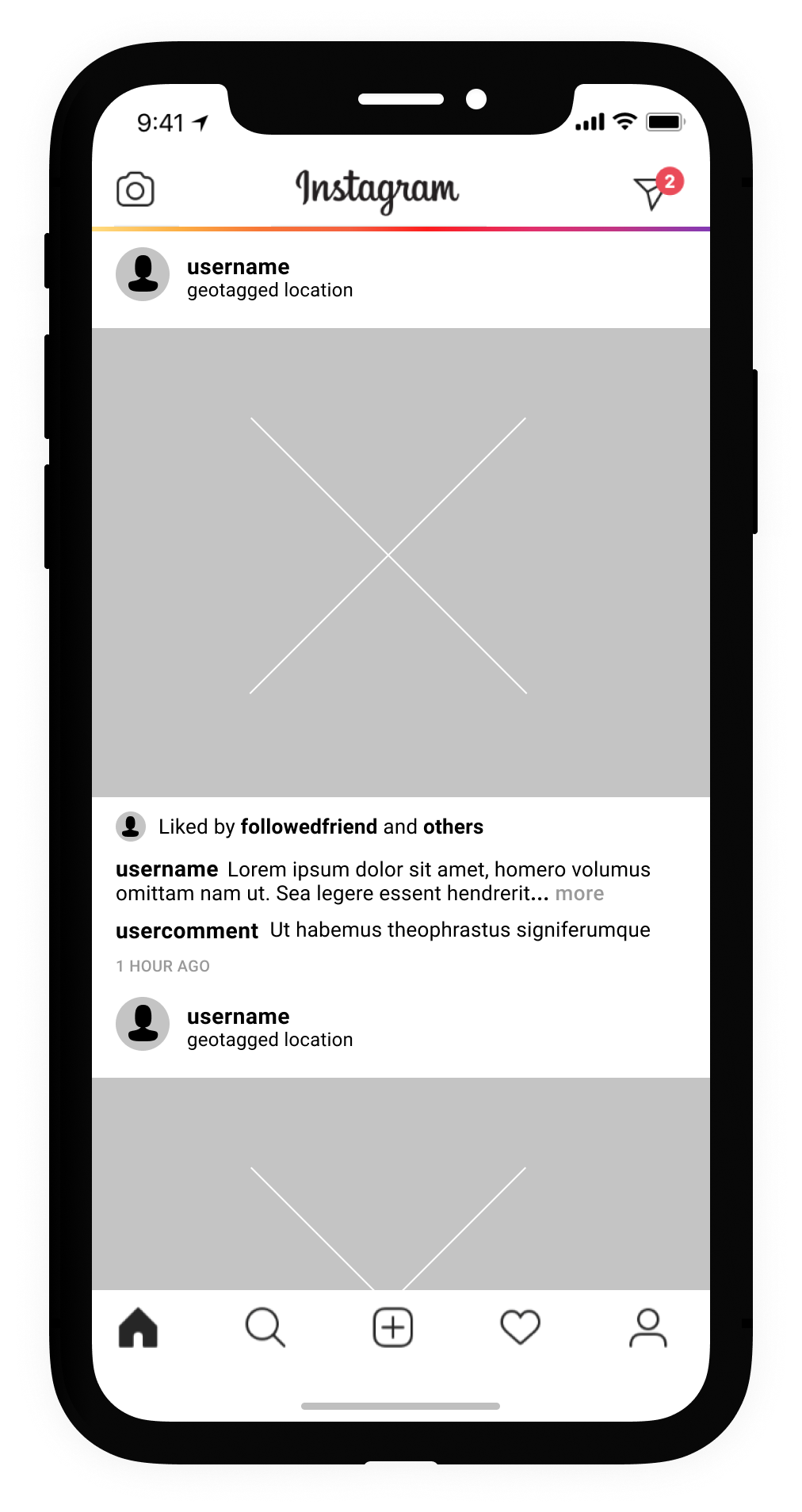
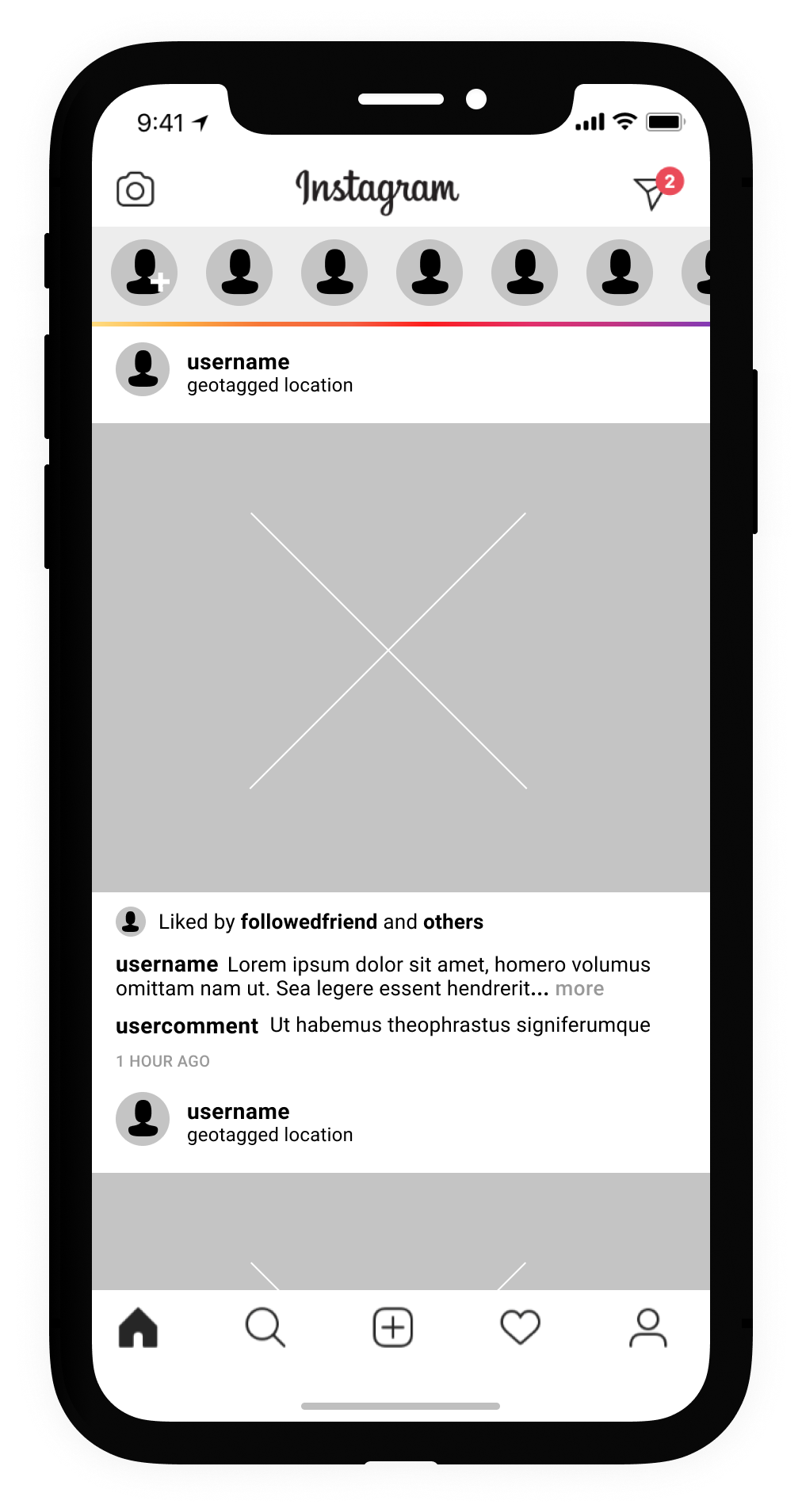
IMAGE (above): Mockup of feed demonstrating a collapsible Stories bar being toggled.Collapsible Stories Bar
Tap line to toggle Stories
Story bar pinned to top of screen
Wherever user may be in feed, a refreshed tray of stories can be toggled to view without disrupting experience
As you scroll,
the Header follows suit and dissolves above feed
and the Footer dissolves, though reappears when screen is tapped or scrolling-back (“up“) resumes
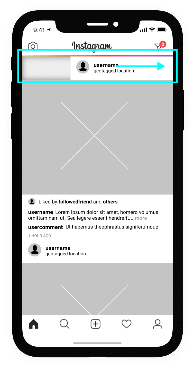
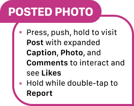
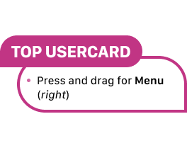
Actionable Usercard
Press and drag user card to the right
this action opens menu for post options
such as copy link or report
Actionable Usercard
IMAGE (above): Mockup of user sliding user card to activate post options from their feed.New Features : Enhanced Viewing
2
Fullscreen Viewing
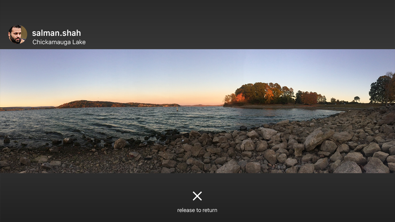
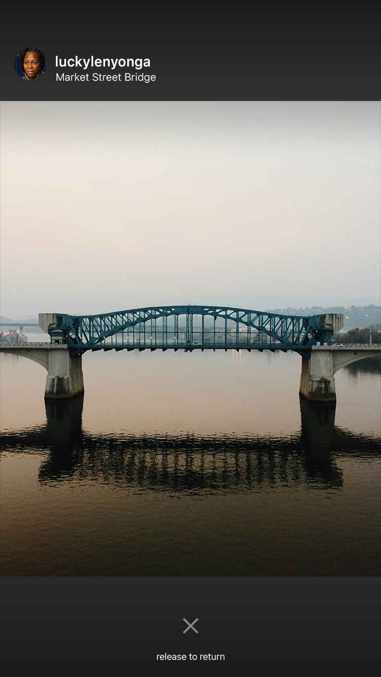
IMAGE (left): Mockup of portrait orientated media at fullscreen viewing.IMAGE (right): Mockup of landscape orientated media at fullscreen viewing.Fullscreen Viewing
Tap and hold on media
If image posted to feed,
image resolution will enter fullscreen when oriented accordingly with device, reversing when tap no longer held or device orientation changed
ex. landscape media can expand to fill screen when device tilted 45 degrees
If IGTV or video,
similar to above will occur, however new video controls appear
media can be made fullscreen regardless of device orientation
The case study resulted in many designs and features to test & explore.
There many considerations made throughout the redesign process.
-
Here are a few:
Can we reinforce the supplier market of Instagram-owned apps?
Ex: Adding micro interactions to enhance viewing within collages with individual photos.
Incorporating early designs of Instagram’s test with eliminating visible counters.
Video control on feed is limited to sound toggle. Can we add more control?
Menu cluttering varies on screen size and dimensions of media. How can we better manage?
Will adding micro interactions - like diagonal directionals - affect viewing multiple media negatively?
What now?
Testing, testing, and more testing.
My recommendations are to look more closely at the socially experimental concepts to gauge reaction, use, and understanding. If we can expand community while bringing aesthetic back (and focus towards user friendliness) to a clarified brand, then Instagram is gold once more.
Adding numerous micro interactions, stripping icons (action points), and adding new features is too much at once. Here is a more manageable phasing:
Add new features
1
Begin to remove icons where new features can serve as signals
2
Begin to add micro interactions relating to features
3
Complete the adding of features & micro interactions and removal of icons
4

Today
Let’s discuss improvements to this project were I to revisit or critique today, and let’s see if Instagram has addressed any of this issues.
-
Since introducing new pattern and behavior, we cannot expect the any user to jump into usage immediately with moderate to full understanding. The proposed designs above represent a dream version in the design-north-star-analogy.
Practically, any roll out would require (initial) signifiers for the Story bar toggle and for the images that can be opened into a larger view.
Additionally, I would recommend testing on accessibility with any micro interactions introduced and touchpoints (48px box sufficiency across devices and accessible demands). I would give special attention to the adoption ease, ease of use, and difficulties across accessibility, demographics, and practical performance (effect during established habits of use, ie. standing in line with hands full)
Adjustment: usercards, the Story bar toggle, and enhanced image viewing should be revisited for styling changes for clarity and contrast improvements
-
Removed likes / added Setting to give higher level of post control with Like visibility
Added micro interactions
Swiping tabs is easier, more clear, and better connected
Photos from the Profile grid can be isolated
Photos can be zoomed in with ease, though videos suffer friction
Enhanced viewing (full screen toggle) with video content
IGTV reworked, now new feature but with video controls
Larger user flow redesign has been undertaken, giving better connection and quicker action portals
Example: Share button and Options button attached to posts and their corresponding sheets