
بشبشا Restaurant
PROJECT INCLUDES
restaurant rebrand
create digital assets
make entirely new menus
prologue
What started as me assisting with creating a workable digital file for the owner to edit and maintain independently, slowly grew to address menu hierarchy and the general readability to conceptualizing a logo rebrand.
original materials provided by client
Photo of current printed copy of menuAbandoned project of rebranding to establish digital presencegetting starting
Interviewing the client, paired with my own research inspired a new, yet familiar direction for the design reset.
Client is an upstart street vendor, bringing industry expertise to an informal setting for an ambitious culinary experience.
Restaurant located in Alexandria, the Egyptian birthplace and center for graffiti arts.
branding
Brand identity encompassing the feel and want of the elevated, neighborhood experience envisioned. A youthful moving spirit happily bringing along legacy and tradition.


explore the visual elements & inspiration


initial logo sketches
Without prior experience with Arabic or the abjad, I wouldn’t be able to create a stylized word logo. Unlike with a latin alphabet, I wouldn’t know the line of legibility in any exaggerated styling.
I studied the abjad and practiced writing right-to-left until I grew some command and understanding. Styling soon came, and I would validate legibility with native speakers.
-
![]()
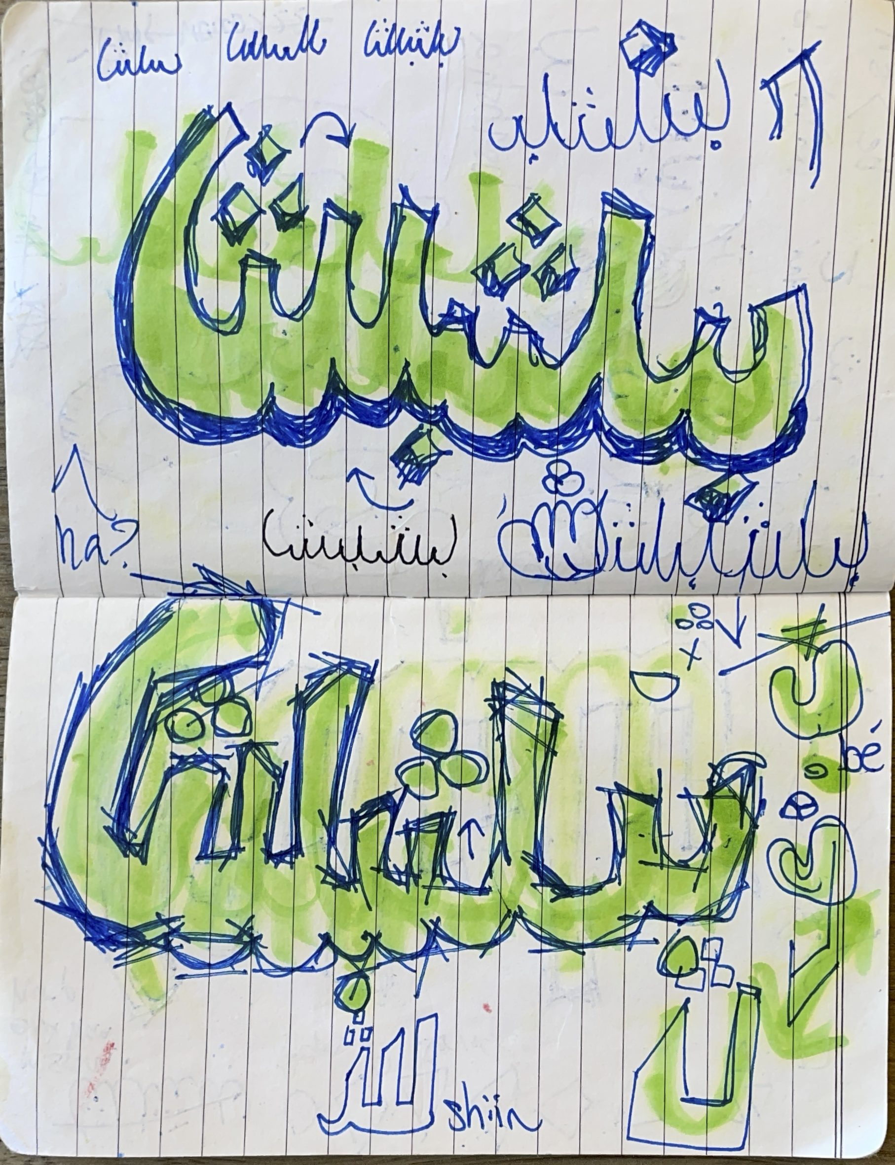
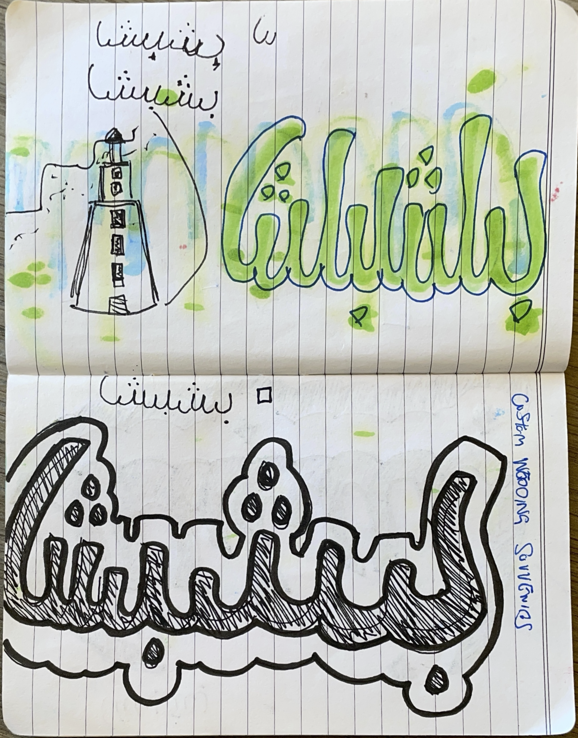
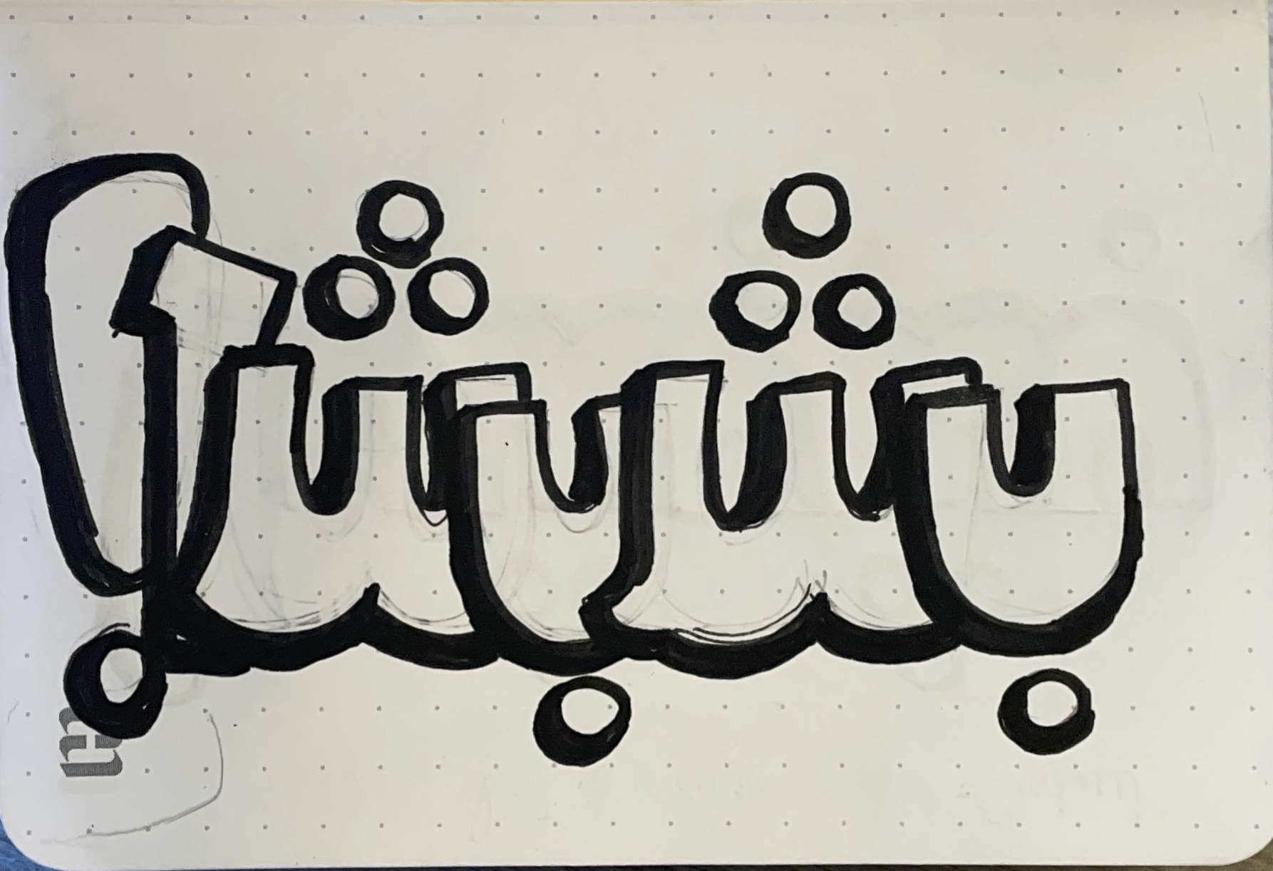
01 : practicing strokes
With limited experience with Arabic script, I spent time practicing writing right-to-left. As this improved, I began using different utensil thicknesses to study stroke and holding these differently, as seen above with a green marker.
-
![]()
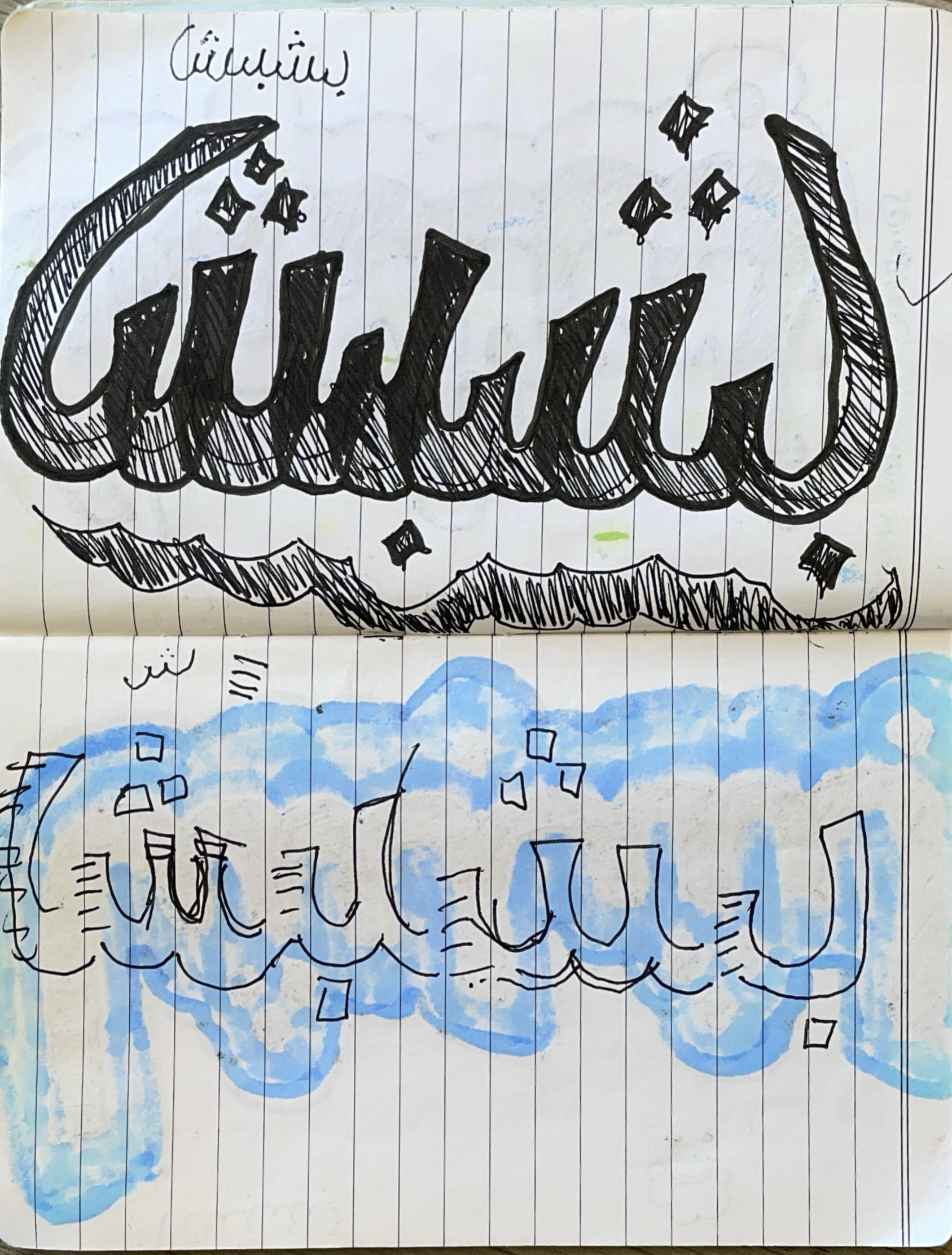
02 : applying styling
As I grew better command of writing in Arabic (a close eye of these sketch notebooks included will illuminate elementary mistakes), I expanded visually to understand early boundaries of style and legibility.
-
![]()
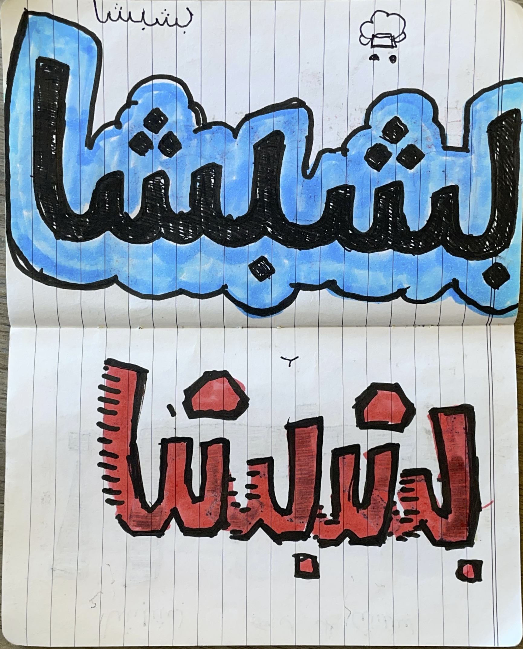
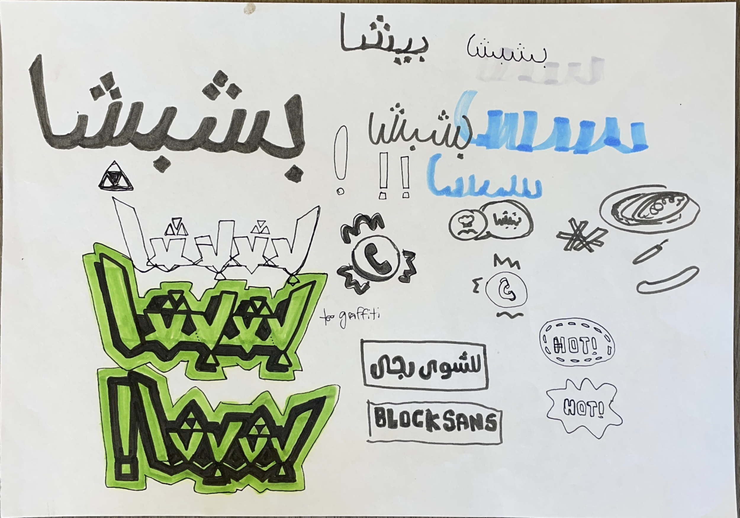
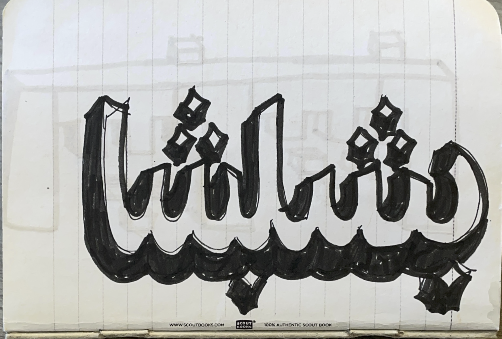
03 : experimenting with strokes in styling
Now begins the fun. I begin adding more visual elements (see: above) and other inspirations to push myself to uncover different interactions within writing Arabic in this context.
-
![]()
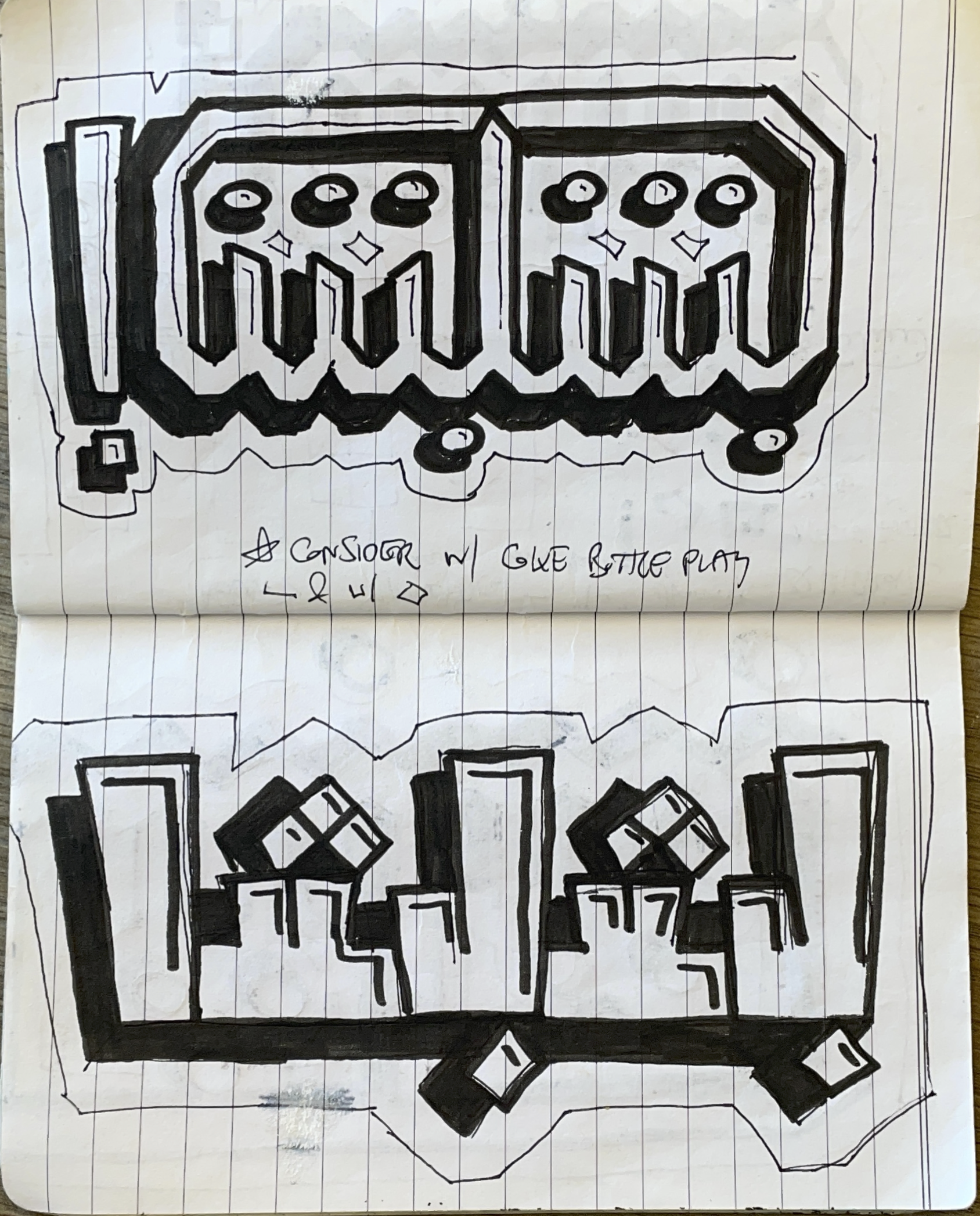
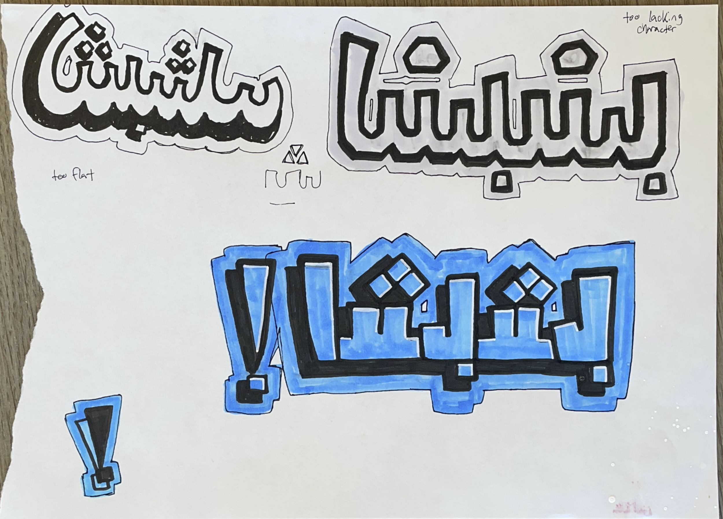
04 : expanding styles and concepts
Previous iterations in experimentations give way to honing in on styling. Here a proliferation of different styles emerge as a result.
-
![]()
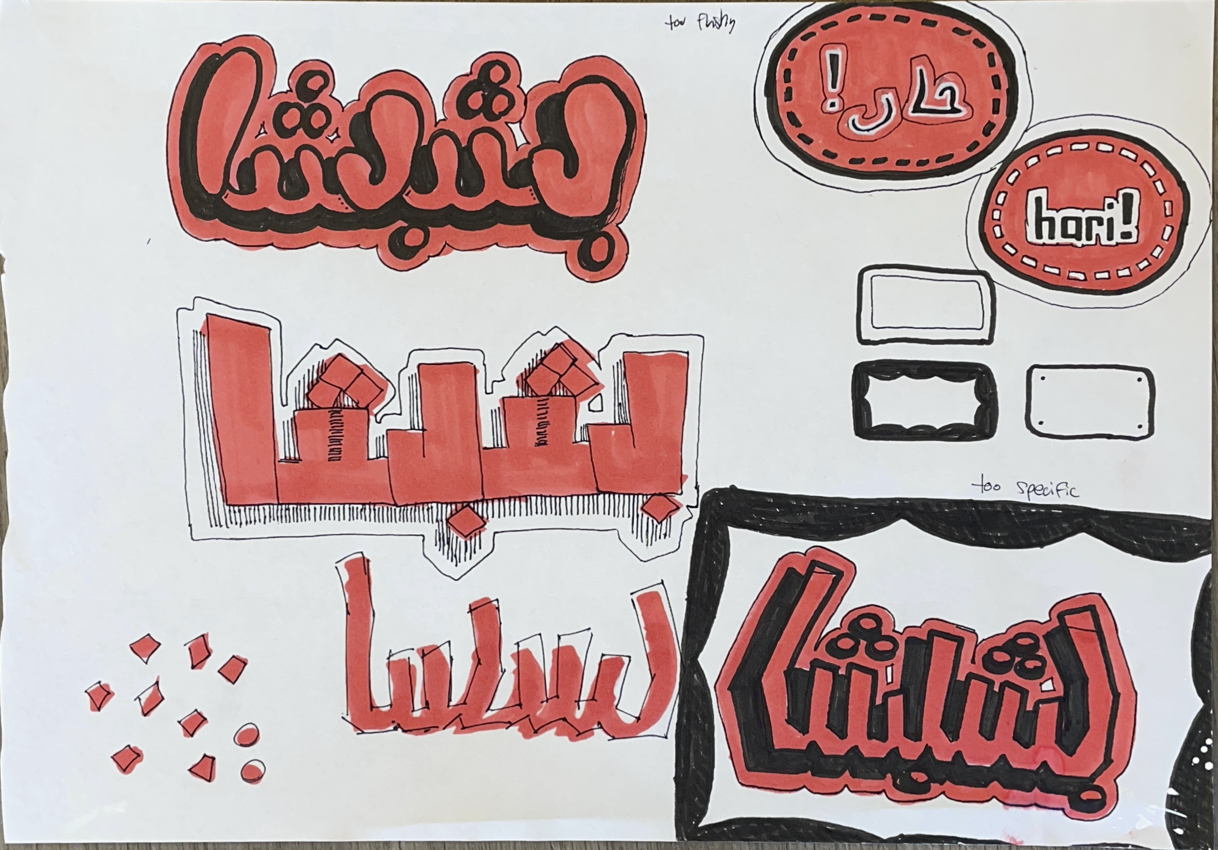
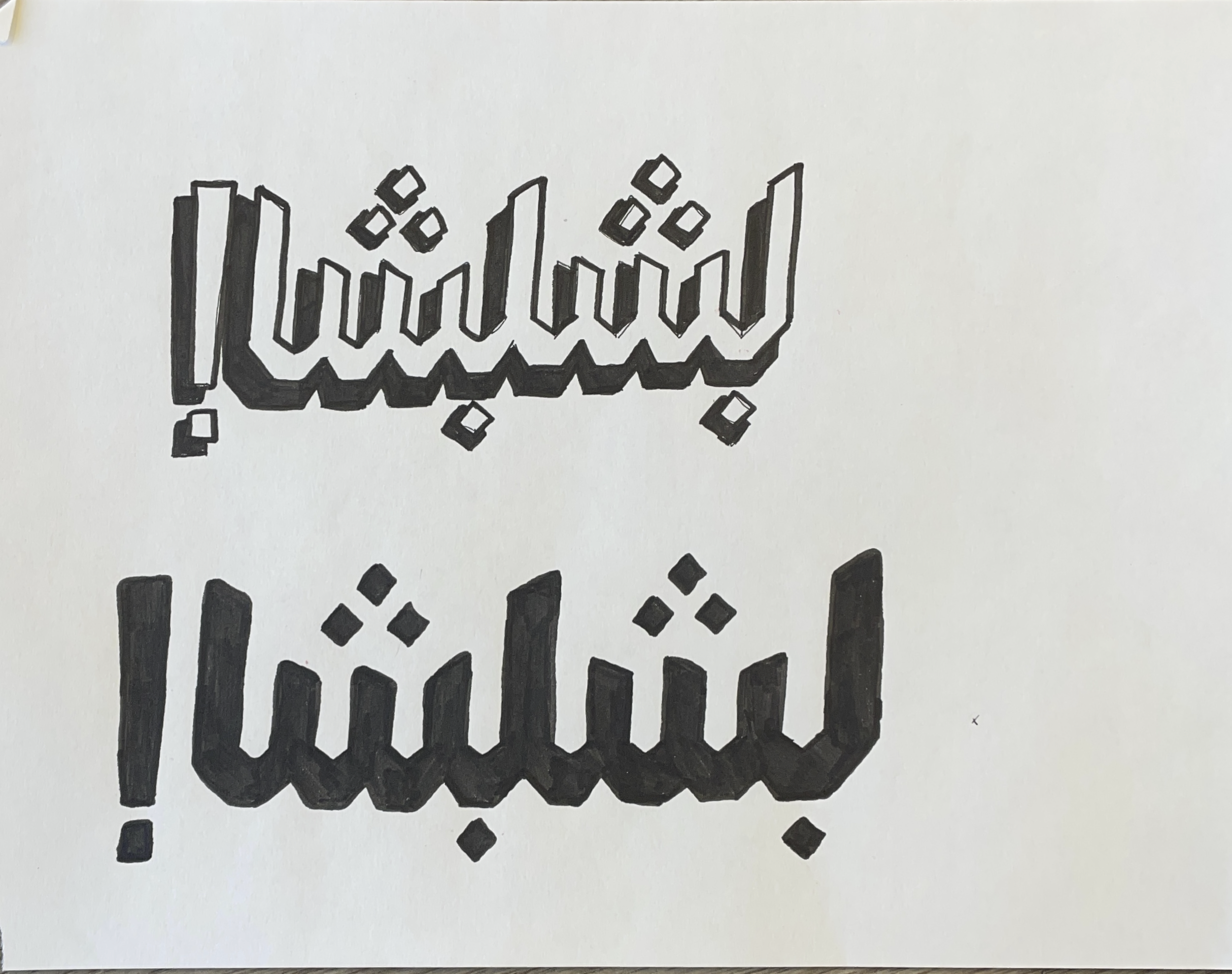
05 : stroke mastery allowing deconstruction for more graffiti styling
And finally, with practice and deeper understanding, I narrow in once more to ideate styling to fit the outlined brand.
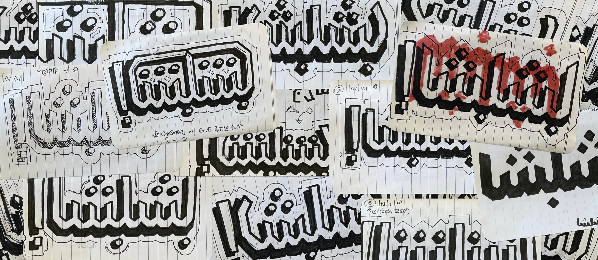
clear concepts
All the sketching led to 6 strong type-variations that were then narrowed to 3 versions for testing and feedback.
Please note: not all sketches of project are presently shown.
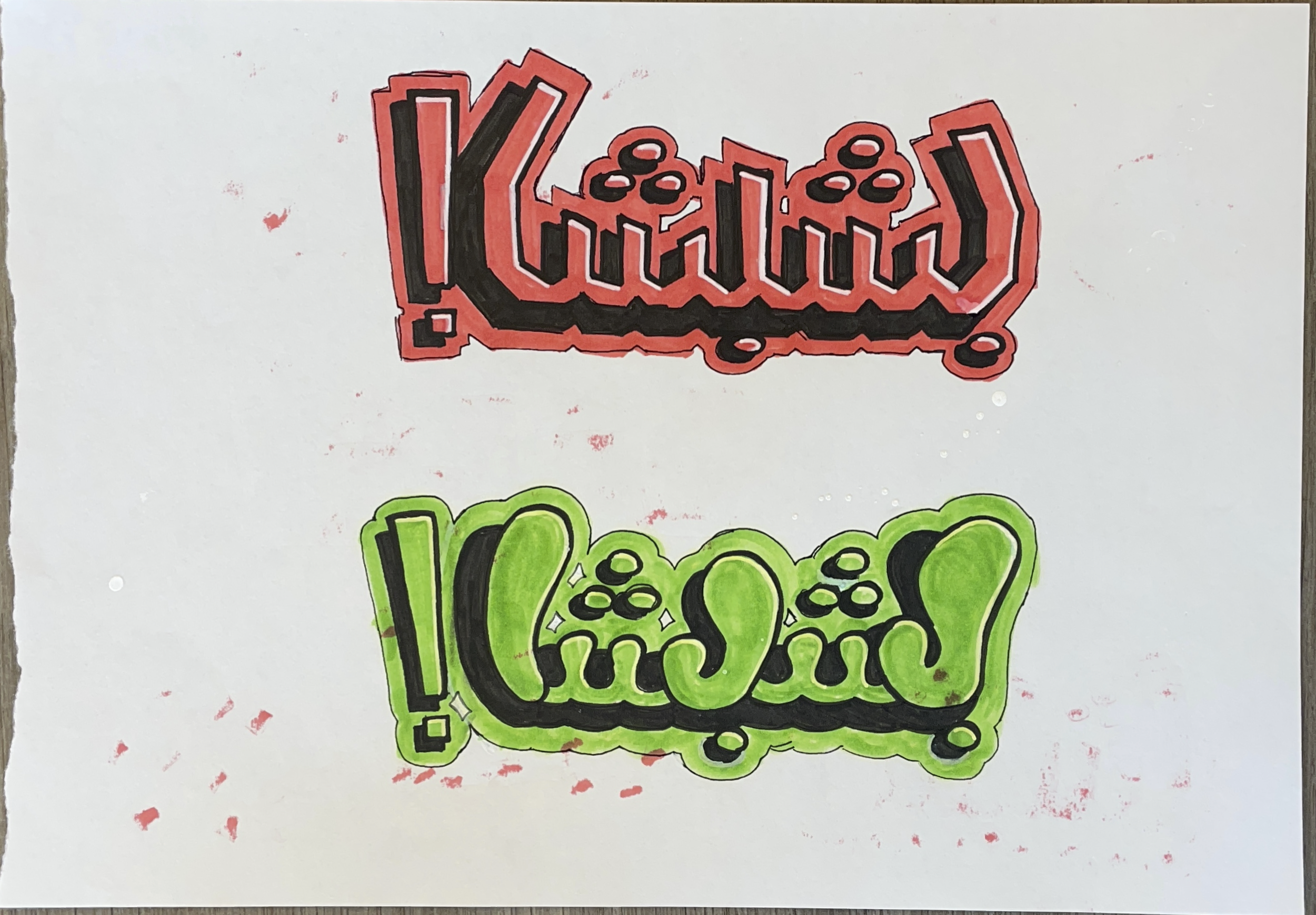
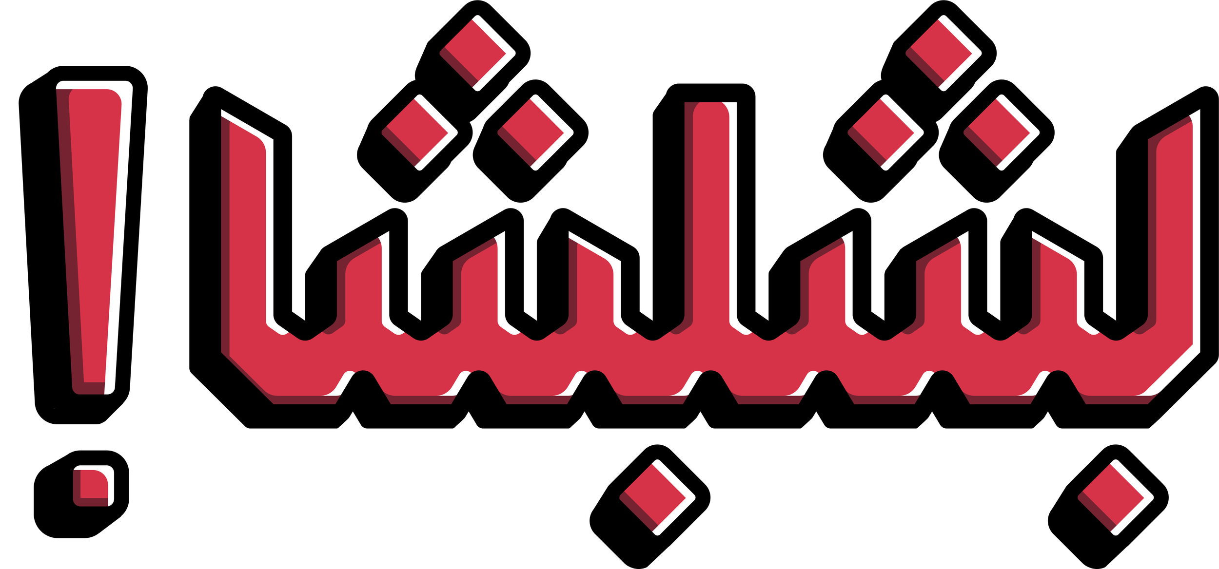
the winner
Titled: “abjad graffiti serif”
Once selected, this base grew to include 10 iterations. The chosen iteration contains a flat, vertical design favoring symmetry play and mirrored angles.
What we like:
familiar
sleek, modern, clean
scalable for characterization
distinct, but not distracting
menu
Originally intended to be graphic and textured, the final design took a sharp turn (for the better).

Client has limited access to document software
Client lacks digital literacy and skills

Create menu to be maintained and accessed from any word processing program (namely, Google Docs)
Adapt brand to be light touch but scalable with growth + styling elements functioning similarly to sticker additions
print mockup
Compare mockup below (left) with the provided image of the original menu (right).
Click on either image to enlarge.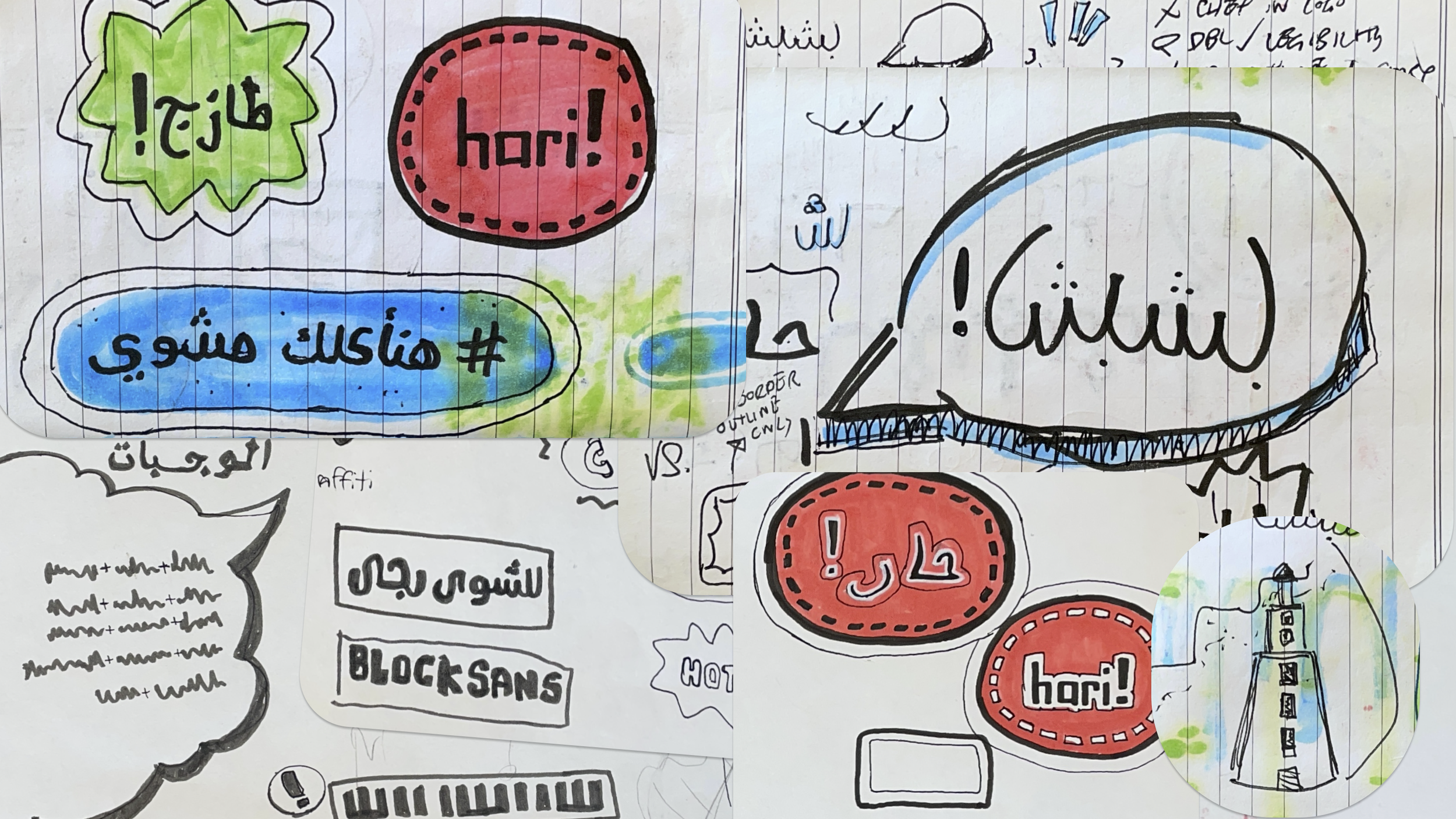
new brand package
Contents are meant to be familiar, but distinct. Every bit is to be stream-lined and graphic.
Click to enlarge the brand guide document.
It was important to the client for Alexandria and its Pharos to be included. Its colors, detailing, and building are all represented within the total brand.

Client was set on this particular stylized-chef as a mascot, so the original draft was cleaned and finalized.
Software and resources used includes: Adobe InDesign, Affinity Studio, Figma (plugins SVG Repo and Skew Skew), Google Fonts, Unsplash (paper texture by João Vítor Duarte, wall texture by Seamless Textures), and LexiLogos keyboards.